
Turning a Feeling Into an Image
Every manuscript carries a feeling — a tone that runs underneath the plot, the characters, the dialogue. It might be quiet and contemplative. It might be urgent and restless. It might ache with nostalgia, or hum with tension. A skilled cover designer doesn't begin by asking what happens in the story. They begin by asking what the story feels like — and then look for the visual language that carries that feeling without saying a single word.
This is the difference between a cover that illustrates a scene and a cover that captures an essence. A literal illustration of a plot moment can feel busy, or worse, give away too much. An essence-led cover works the way a piece of music works — it sets a mood the reader carries with them into the first chapter, so that by the time they start reading, they are already halfway into the world.
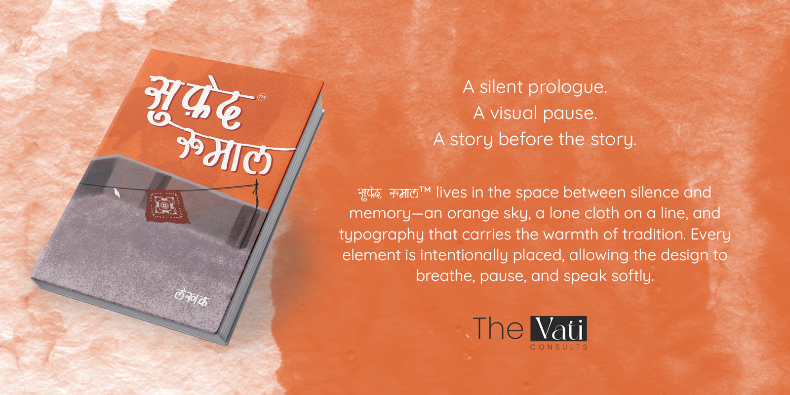
Consider a cover built around a single domestic image — a quiet rooftop, washing on a line, the soft texture of an evening sky. Nothing on that cover tells you the plot. But everything on it tells you how the story will feel: intimate, slow, textured with memory, rooted in a particular place and a particular kind of life. That is translation. That is what a cover is for.
Before the First Sketch, There Is a Reading
The work of representing a story's theme through cover design begins long before any visual concept is sketched. It begins with genuinely engaging with the manuscript — not skimming it for keywords, but reading closely enough to notice the details the author may not even realise are doing the most work.
What recurring images appear in the text? What colours does the author reach for when describing emotion? Is there an object, a place, a gesture that returns again and again — something that has quietly become the emotional centre of gravity for the whole book, even if it's never named as a 'symbol'? These small, recurring details are often the richest material for a cover, because they come from inside the story itself rather than being imposed on it from outside.
The Title Is Part of the Image — Not Separate From It
On many covers, the typography is treated as a separate layer — text placed over an image, chosen for legibility and little else. But on the covers that stay with readers, the typography is doing as much storytelling work as the artwork itself.
The shape of the letters, the weight of the strokes, whether they feel handwritten or engineered, traditional or contemporary — all of this carries meaning. A title rendered in a script that feels like it was written by hand, with the slight irregularity of ink on cloth, tells the reader something about the world of the book before they've read its first sentence. It might suggest intimacy, tradition, a story rooted in a particular cultural texture. A clean, geometric sans-serif would tell a completely different story — even with the exact same image behind it.
This is especially true for titles in regional scripts. A Devanagari title set with warmth and character, rather than a default digital font, can carry the same emotional weight as the illustration itself — sometimes more. The typography becomes inseparable from the artwork; together they form a single visual statement about the book's identity.
What a Cover Leaves Out Matters as Much as What It Includes
One of the most common instincts in cover design — especially when a story is rich and eventful — is to try to fit everything in. A character here, a setting there, a symbol, a colour palette that nods to three different plot threads. The result is often a cover that is busy without being meaningful, crowded without being expressive.
The most resonant covers tend to do the opposite. They choose one image, one moment, one feeling — and give it room to breathe. A single object against an open sky. A figure seen from a distance. A piece of cloth on a line, with empty space all around it. That empty space is not absence. It is part of the design. It gives the eye somewhere to rest, and it gives the image room to feel quiet, the way a pause in conversation can say more than words.
This kind of restraint takes discipline — and trust in the reader. It assumes the reader is intelligent enough to feel a mood without being told what that mood means. A cover that whispers, rather than announces, often says more, and stays in the memory longer.
How TheVati Consults Builds a Cover Around a Story's Theme
When TheVati Consults begins work on a cover, the process always starts the same way — with conversation and close reading, not with stock imagery or trend boards. The team spends time understanding the manuscript's tone, its setting, its emotional arc, and the audience it is written for. Genre matters. Market matters. But theme matters most of all, because theme is what the cover ultimately has to carry.
From that foundation, multiple concept directions are developed — not as variations on a single idea, but as genuinely different interpretations of the story's emotional core. One direction might lean into a central symbolic image. Another might explore atmosphere and colour alone, without any literal imagery at all. A third might focus on typography as the dominant element, with illustration playing a supporting role. Presenting real alternatives, rather than one polished idea and two throwaways, gives the author and publisher a real choice about how the story should first present itself to the world.
Every detail is considered in service of the theme — the colour palette, drawn from the world of the story rather than from current design trends; the texture of the illustration, whether clean and modern or soft and hand-rendered; the placement of the title, and how much space is given to breathe around it. Even small decisions, like whether a trademark symbol sits quietly beside the title or is omitted entirely, are made with the overall feeling of the cover in mind.
The result is a cover that doesn't just sit on the shelf looking attractive. It sits there telling the truth about the book inside it — so that when a reader picks it up, the story has already begun.
A Cover Is a Promise — Keep It Honest
A book cover makes a promise to every person who looks at it: this is the kind of experience you will have if you open this book. The most powerful thing a cover can do is make that promise honestly — not by shouting louder than the book itself, but by capturing, in a single still image, the feeling that the author spent months or years putting into words.
That is the work of theme-led cover design. Not decoration. Not trend-following. A genuine act of translation — turning a story's heart into something a reader can see, hold, and feel, before they've read a single word of it.